Not sure where to post this, so I do it here. I have been testing the app a bit. And with both the Firo wallet, FiroDex and the new phone app it is so many small design bugs. It’s some small things and some bigger issues, you notice it straight away so not sure how this are ignored. It is also so many just weird bugs that I don’t understand how they made.
All these small details might not seem important, but it just make it seem rushed and low quality.
Here is part one:
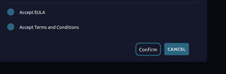
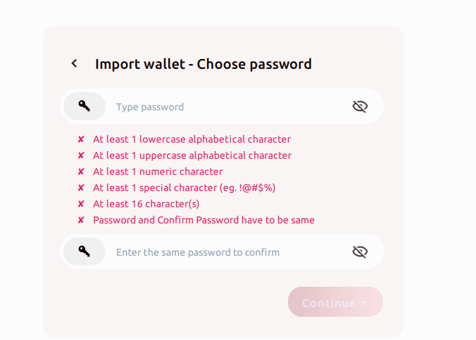
The password requirements are insane, minimum 16 characters password? And lowercase, upper case, symbols and numbers?
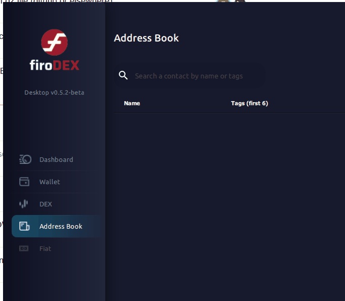
Weird bug when you switch between address book and DEX, what the hell is going on here? One of the menu items change the whole meny list, and redirect to a new page, all the others change the meny list back again? What?
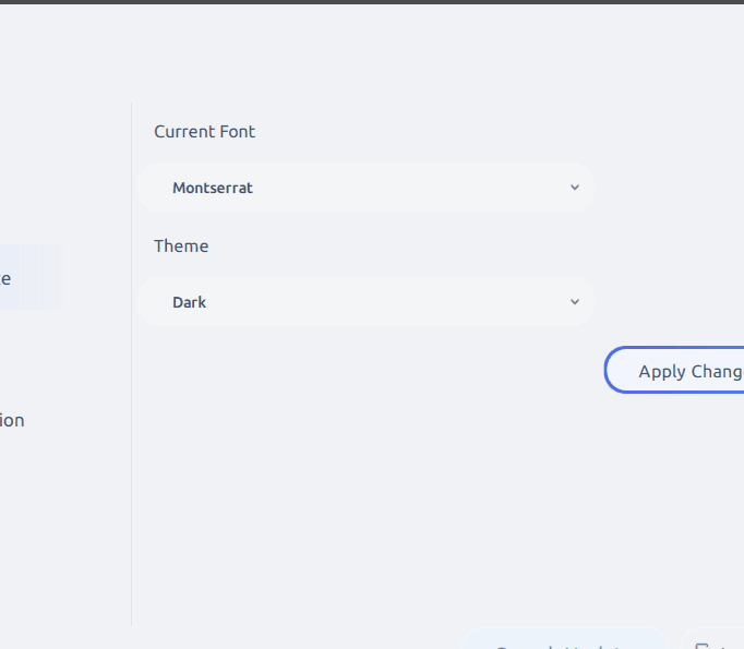
Rounded corners, then not rounded corners, then back again? Highlight in blue, then highlight in gray? Rounded corners on the bottom, but not on the top, does not fill the whole selected item.
Rounded corners on all items, except the last item. No space between item in the list,
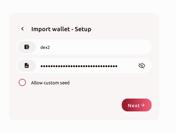
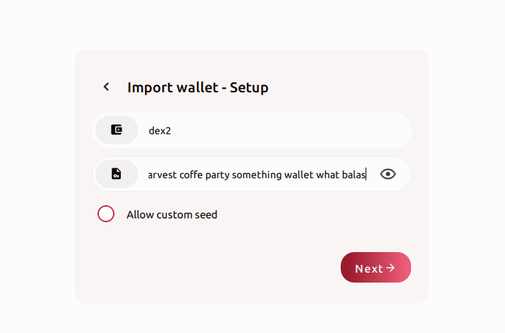
Another point, filling out the seed phrase, this is just one small text box. Normally used for passwords, so it’s hidden by default, so when you type you get “***** *****”, need to make a much better way of adding a seed phrase.
Thank you for taking the time out to bring up all of this, Lightningdev! The forum is an excellent place to post this kind of feedback! I’ve relayed this information so that it can be looked at and potentially get tweaked. FiroDEX is still a work in progress and is currently in beta, so this feedback is really useful and exactly what we like to see from the community!
The only thing I would like to ask about is what would you rather see than the password as it is right now? The requirements are pretty run-in-the-mill on the internet, services, apps, etc. Are you more interested in something like a pin?
Hey lightningdev I notice you’re using an older build? A lot of the stuff were fixed in the newer versions. Could you try it out? I think the latest is 0.5.4
You are welcome, it’s ok that’s a password input. I was thinking you could reduce the password requirement a bit. 16 characters is a bit much, never registered somewhere were the password requirement was 16 characters minimum, pluss upper, lower-case, symbols etc.
Should measure password strength, not just have a list of requirements. If you type a long sentence for example, that would be a strong password, and should be enough, don’t need to have symbols in addition. Or if you create a shorter password, but have symbols and upper lower case, that is also ok.
That being said, some of what you bring up does remain so we’re looking into it further. Thank you very much for taking the time out to help us! We would really appreciate it if you give the newest release a whirl!
People are just going to lock them self out of this wallet and loose access to their Firo.
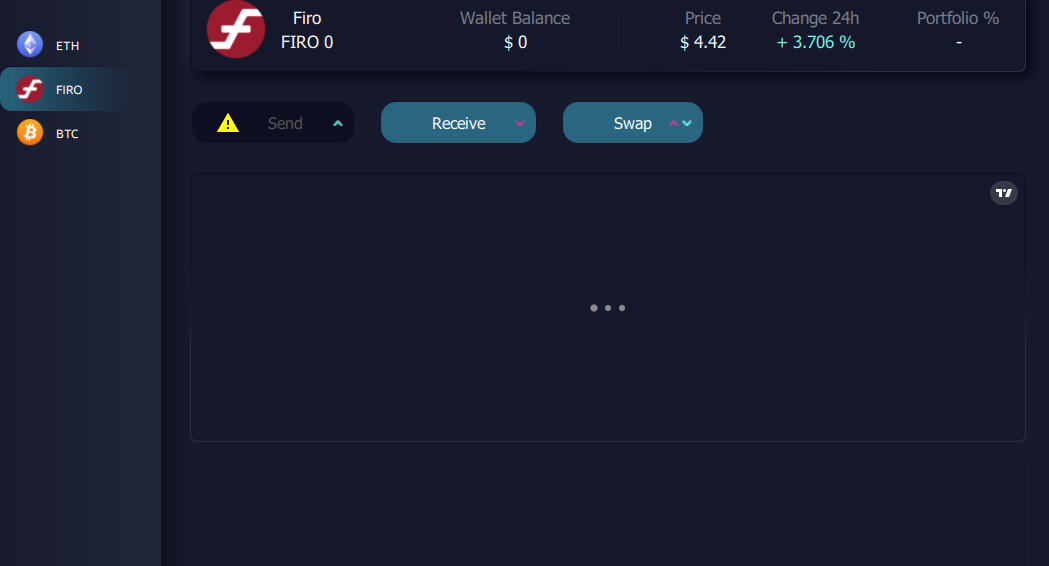
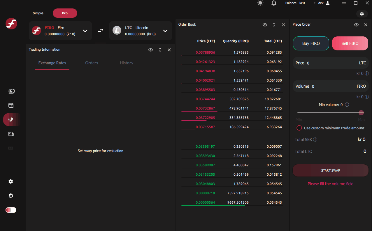
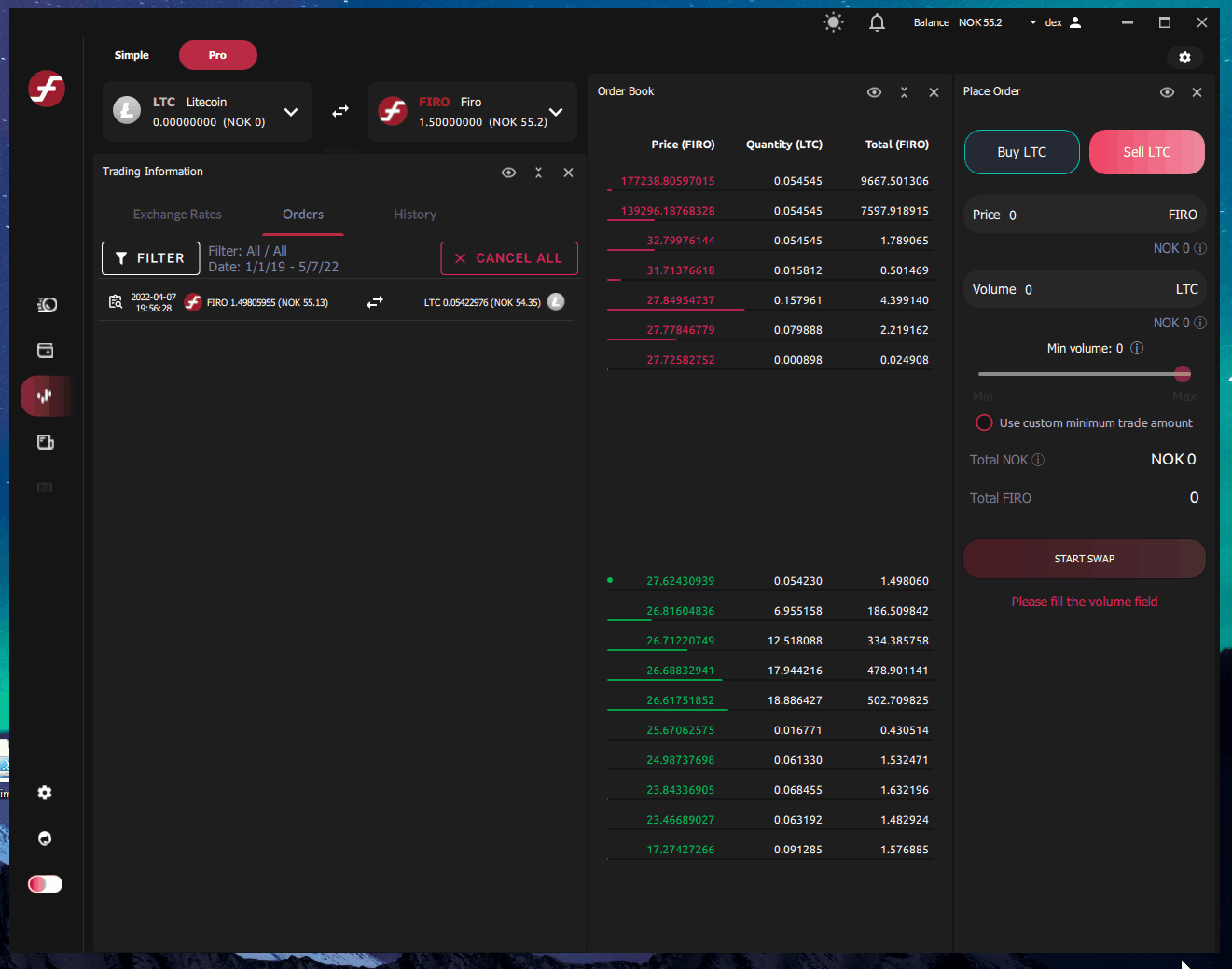
Clicking on the price you want does not work
When you click on the price you want, nothing happens. Should set the price. Also, many countries use comma, and not dot, when setting decimals. Nothing happens when you click comma, that is annoying when that is how you type 1,5 in your country.
Also, you can not click on min and max, these should be buttons. When you click max it should set it to max.
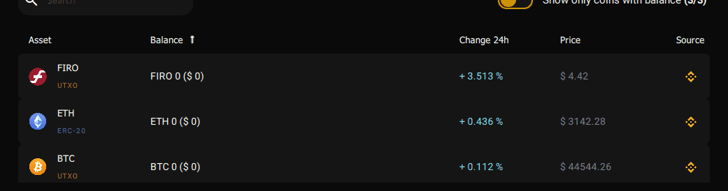
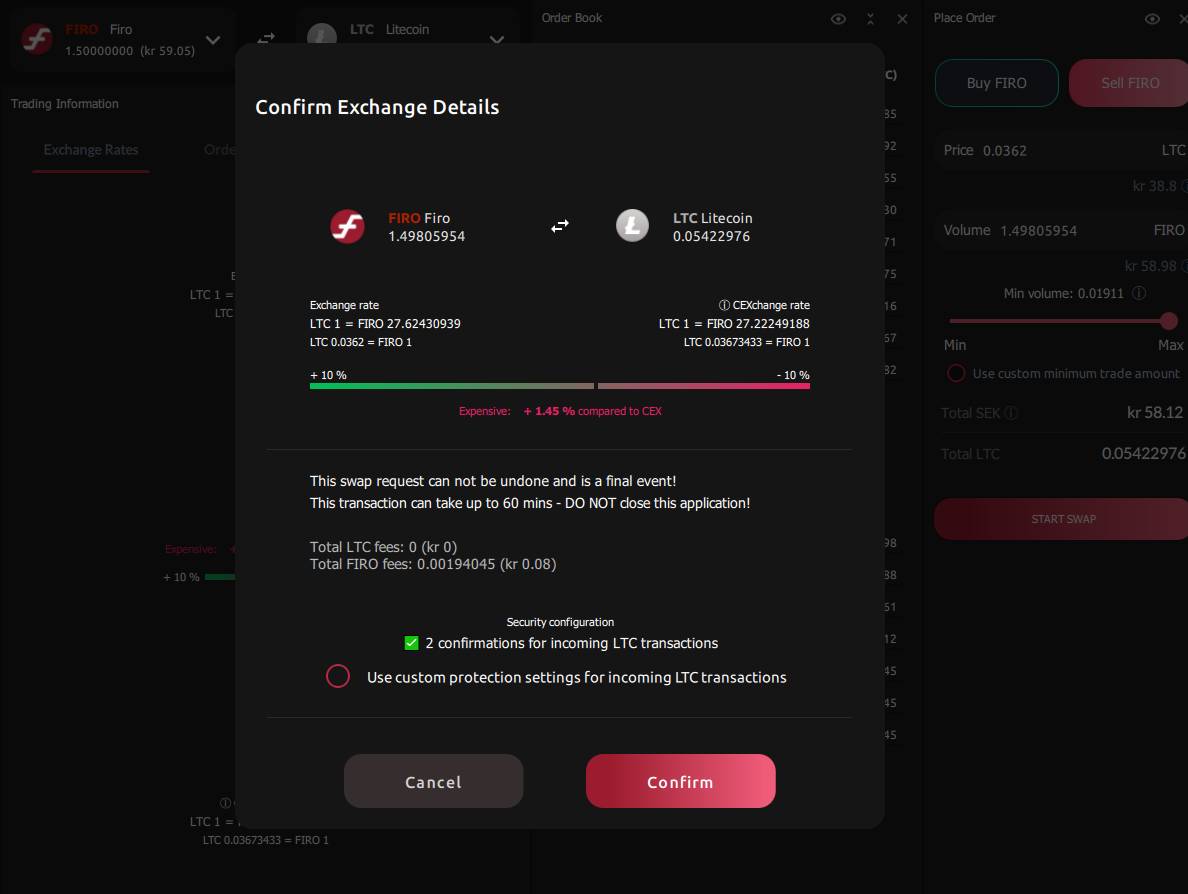
Comparing to CEX looks good, like that you can see the price compared to CEX. Nice feature
Any chance firodex will come to mobile? Convenience for trading anonymously while on the go would be a huge hit, especially when im barely near a computer